Customers and Partners regularly ask me about building charts in Dynamics NAV. There are a few different ways in which you could do it. Here, in my first blog, I have listed 5 different ways in which you can build and view charts:
(Feel free to jump directly to any of the specific methods)
1. Show as Chart feature – The simplest way to do it [Go to the top]
Almost all the List pages in Dynamics NAV have an action button to show the list data as a List or as a Chart.
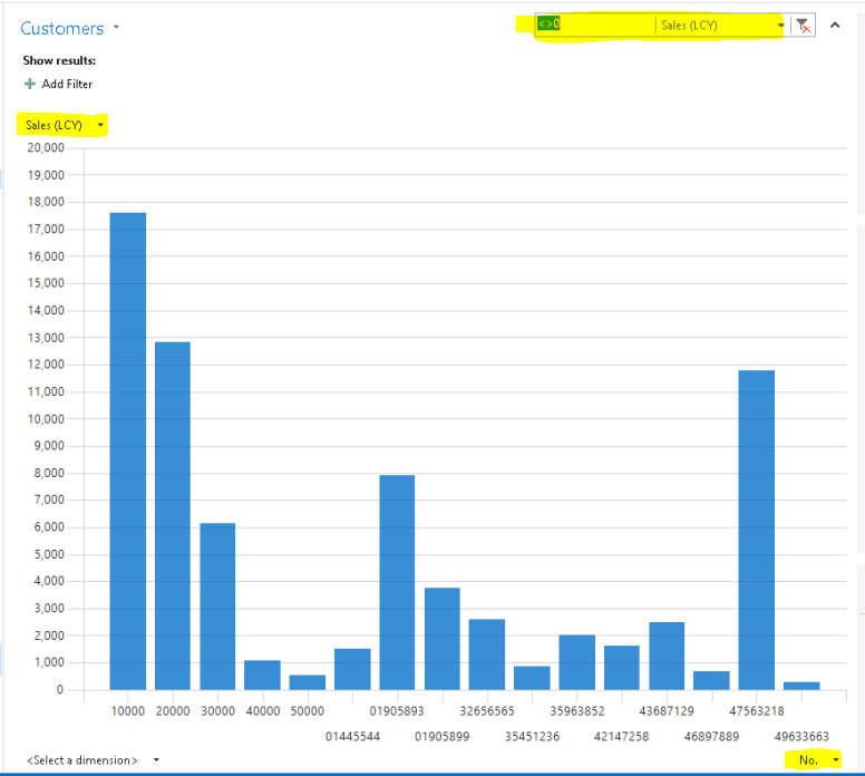
Lets use the Show as Chart option in Customers list to look at the customer sales.
All we need to do is
a. Open Customer List in NAV and click on Show as chart
b. Choose x-axis measure at the right bottom. (For ex: No.)
c. Choose y-axis measure at the top left. (For ex: Sales(LCY). You can have multiple y-axis measures as well which is awesome)
d. Optionally, you can also select a z-axis measure at the left bottom and have a 3D chart.
e. You can filter your data on charts similar to filtering data on lists.
In the below Chart, I have filtered on Sales (LCY) <>0:
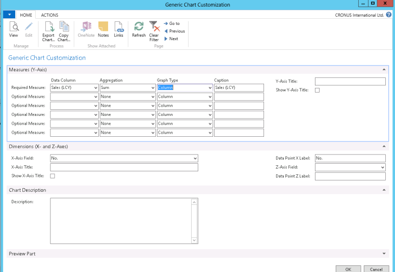
This feature uses the Generic chart customization in the background. You can right click on the chart to see multiple options like save picture as, Print, customize etc., You can click on Customize which opens Generic chart customization window (as shown below). Here you can add more measures, change the graph type (pie, Doughnut, Line etc.,) , copy chart (for e.g., to use it as a chart part in your role center) etc..
2. Generic charts [Go to the top]
To display charts on role centers or alongside other pages, we need to save the chart under Generic charts. Dynamics NAV has multiple generic charts out of the box built on table and query objects. We can also add more generic charts to this list. Generic charts are simple. All we need to create a generic chart is the Source (Either a Table or a Query object) and specification of x-axis and y-axis. Optionally, we can specify z-axis measure, filters and multiple y-axis measures on the chart.
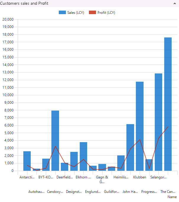
Below I’ve defined a generic chart based on Customer table to show Customer Sales vs. Profit.
a. Search for Generic charts in the search area of NAV windows or web client and open the Generic chart Page. We see a list of charts here. You can select any line and click on edit to explore how the existing generic charts are defined
b. Click on New and enter the values as shown below:
Here we are trying to use the Table Customer with Customer Name in the X-axis and Sales (LCY) and Profit (LCY) in the y-axis. I have also added a filter to display customers whose Sales (LCY) value is <>0
c. Click on OK at the bottom to complete the design of the chart.
d. To view this chart, add it to the Role center. (click on Blue button at the top left –> Customize–> Customize this page–> Chart part–> Add. Select the Blank chart–> Customize part–> Select T-00001–> Click on OK) Now we see the below chart part in the role center:
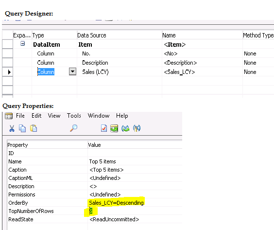
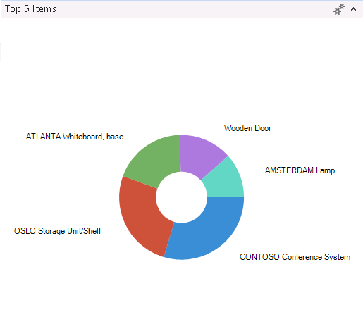
In the following steps, I have built another generic chart based on Query object (in contrast to using tables as shown previously) to show the Top 5 selling items.
a. In NAV development environment, design a new Query (ex: 50000) to show top 5 selling items and save.
b. Search for Generic charts in the search area of NAV client and open the Generic charts page.
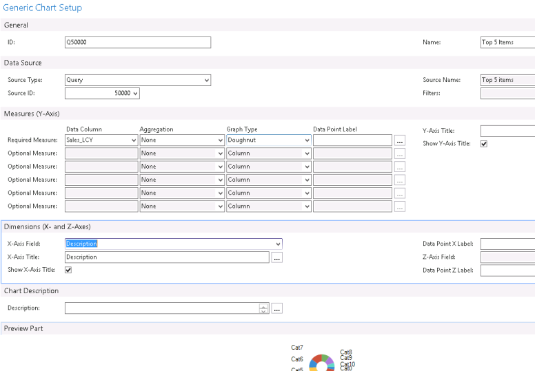
c. Click on New to define a new chart and specify values as shown below.
d. To view this chart, add it to the Role center. (click on Blue button at the top left –> Customize–> Customize this page–> Chart part–> Add. Select the Blank chart–> Customize part–> Select T-00001–> Click on OK) Now we see the below chart part in the role center:
More resources on Generic charts: How to: Create Generic Charts, How to: Add Charts to Role Centers and List Places; How Do I: Build a Chart Based upon a Query
3. Business charts [Go to the top]
Business charts are based on Business Chart control add-in which is provided by the Microsoft.Dynamics.Nav.Client.BusinessChart.dll assembly. The Business Chart control add-in is a Microsoft .NET Framework object that creates the user interface of a chart on page and populates the chart with data from C/AL code. By default the assembly is located in the C:\Program Files (x86)\Microsoft Dynamics NAV\71\RoleTailored Client\Add-ins\BusinessChart folder. As compared to other chart types, they provide advanced functionalities such as:
- Displaying complex data that is calculated on a page.
- Allowing end users to filter data and drill down to the details from the chart
- Being supported on Dynamics NAV Web client.
Out of the box, there are a few business charts such as Trailing sales orders, Cash flow chart, Finance performance, Sales performance, Inventory performance etc.. To design/develop a business chart, one should have experience on C/AL programming. You can explore the existing business charts by adding them to your role center using page designer.
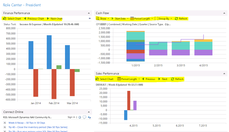
In the Cronus demo database, business charts are available on Order processor, President, Accounting manager and few other role centers. For e.g., below picture shows President’s role center which contains 3 business charts (Finance Performance, Cash flow, Sales Performance). These charts have filtering options as highlighted below:
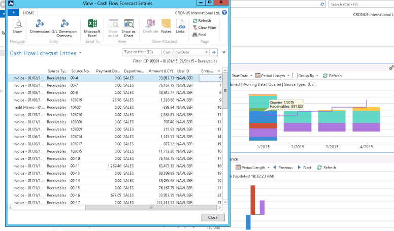
Also, it is possible to drill down by clicking on the different areas of the chart:
More resources on Business charts: Displaying Charts Using the Chart Control Add-in, Cash Flow Chart Example
In my next blog, I will be explaining Business charts in detail.
4. Charts in NAV reports [Go to the top]
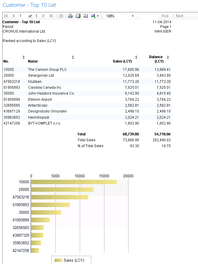
Both Visual Studio Report Designer and the SQL Server Report Builder gives us the option of inserting chart controls in our reports. Customer – Top 10 List is a good example which shows a chart in a report along with report data.
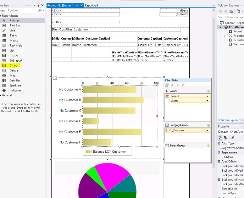
In the below illustration of the NAV report layout designer, 2 types of charts are defined with values and categories.
To display a chart in NAV report:
- Drag and drop the Chart control from the toolbox
- Add/Change the measures under Chart Data
- Right click on the chart and select Change chart type to select a different graph.
- Right click on the chart and select Chart Properties to make changes related to visibility, filtering etc.
5. Charts in Excel [Go to the top]
Dynamics NAV tightly integrates with Microsoft Office Excel. Excel has powerful charting capabilities using which we can analyze Dynamics NAV data. Following are some of the ways to export NAV data to excel:
- Using Send to Microsoft Excel option on a page or expose NAV page as a ODATA web service and retrieve this data in Excel.
- Using XMLPorts
- Using Query results or expose it as a OData web service and retrieve this data in Excel.
Following video shows how we can view Sales and Profit region wise on a map in Excel using Power View.
How Do I: Consume a Microsoft Dynamics NAV 2013 Query from Excel Power View
In my next blog, we will explore Business charts in more detail.

